Saturday, 23 October 2010

Accidental Alphabet


Internal Environment design #2

I put this design together by printing an image of the ticket and album cover layered up on brown paper and using pieces of information ripped off of the ticket.
Included in the editing of the image I used photos, text dialogue that I picked up from the time spent in the venue and a quick drawing overlay within the image.
I'm happy with the result I got from this design, I think it looks good printed and on the computer.


Sense of Place Final Designs


Sense of Place Design #2

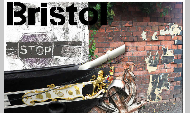
I used scanned images from my book & edited them mainly using the magic want tool to start with.
To create a quick title I drew the word Bristol and scanned it in to cut out, from the fist cut of the magic wand tool there are still some edges left but as I was going to give it a colour full and apply an effect it wouldn't show.
I liked the image of an old map I took from around the water front and the stencil of the sign I created in my book came out quite well so I decided to use both and overlay the map with the 'lighten' tool in Fireworks. 
Again using the magic wand in photoshop I roughly cut the ship, as the background is light it didn't need to be cleanly cut.

Sense of Place Post Card update

Using all the different image elements that I used the first time I added in a photo cut of the ship & changed the drawing of the anchor back to the original unedited version.
I decided to better fill the space I wanted to move the photo of the image on the wall up, but also wanted to keep the plant that was at the top, to do this I had to copy the top and blend it to overlay the lower part of the image.
 As there is a lot more shadowing at the top of the image to make the colours fit with the lighter, lower section of the photo I used the brightness/contrast to change the tone.
 I also decided that keeping the plant all the way down the image might be quite effective, just to break up the white section a little more. I cut out sections of it with the lasso tool till I was happy.
 To finish it I cut the edge around the photo to fit the edging of the 'paint' back in.
As a final design comparing it to the original edited image I had, I think it works a lot better as it has a feature associated with Bristol so is more easily identifiable to the area and particularly the water front, being a ship.


Friday, 22 October 2010

Final Edited Design

This is the final design that I have created so far, I might want to work back into it at a later stage or test out some new ideas. Looking at the design I'm happy with it overall, if I do change anything I might see if there is a better composition as the space on the left looks a bit empty but I don't really want to add any more to it, so re-arranging it could be an option.
Thinking of a possible ideas for the space I could add some of the dialogue I got from people who were in the venue at the time.

Internal Environment: Jazz Cafe

Editing some ideas for a postcard representing time that I spent in the Jazz Cafe, London.
Mapping out the outline using 'pen tool' [Photoshop]
Again using the pen tool to fill in sections with colour, I used folders for sections to make it easy to edit if needed.
The final design & adding a little tint, gradient for some extra detail
Using effects to edit some of the font from the image [Macromedia Fireworks]
adding a photo I took of the outside of the venue into the image I used the 'Soft Burn' tool in Fireworks to get the effect for the colours to blend in, then cut out some of the unwanted part from the photo.