Tuesday, 14 December 2010
Friday, 10 December 2010
Magazine Layout design
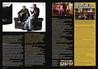
Again I tried out another layout looking at this spread from RWD Mag, I decided to base the main layout on this design.


To give myself guide lines I created a grid shape for the rough layout from different coloured sections. Then using the red guidelines I placed and sized an image to fit within the area.

Using the shape tool I drew out a coloured box for the right hand page and then as I was going to make the magazine spread based on Capital FM's Jingle Bell Ball concert I used the colour from their logo to fill it.

Again switching on the viability of the guidelines I added another image.


I wanted some images that broke out of the set layout a little so got an image and used the 'Elliptical Marquee tool' to cut a piece out into a circle, overlaying it on the colour filled column and the blank space next to it where the text would be. Using Grey lines to mark out where text would be printed I inserted text lines then cut a space around the image to show how it would be set.

Using the Polygonal lasso tool I marker around the edges of the image and cut it out, Then again cut the shape in to the text lines to show how it would sit.


I added in some more images and text space and decided to have the text in blue [taken from the logo] on top of the coloured column.

Where I was going to have a heading on the top of the coloured column I wasn't finding any fonts that I was happy with so decided I'd try something in Illustrator using things that I had learnt from the illustrator workshops I was able to look back at the notes I took and create the title I was looking for, text cut out of a colour block giving a bit of negative space.


Wednesday, 8 December 2010
Time lines
Timelines show a selection of information in a scale that enables you to see the whole thing.
Having a start and end usually displaying a period of time.
Orders information.
Planning for creating a timeline
-collect the information, time scale, dates, information, images etc.
-sketch out an idea for layout / print out the images / text and arrange them to gain an idea of how it would look.
Illustrator Tools that are helpful for creating the timeline
view > show Grid
illustrator > preferences > guides and grids -change grid size
file > place images [import images]
I put together a quick idea for a timeline this just shows how it could possibly be set out in a short amount of time.
with Gridlines
 Without Gridlines

Having a start and end usually displaying a period of time.
Orders information.
Planning for creating a timeline
-collect the information, time scale, dates, information, images etc.
-sketch out an idea for layout / print out the images / text and arrange them to gain an idea of how it would look.
Illustrator Tools that are helpful for creating the timeline
view > show Grid
illustrator > preferences > guides and grids -change grid size
file > place images [import images]
I put together a quick idea for a timeline this just shows how it could possibly be set out in a short amount of time.
with Gridlines


Tuesday, 7 December 2010
Magazine Layouts
Existing Layouts
I did a web search for magazine spreads and picked out a few that I found interesting from looking at there layouts, colours and content.
I quite like the way this page is set out with the black and white divided, I think it works well as the car is silver so has a lot of tones from white to black, I think the only thing I'm not sure about it the choice of the main title font, I don't think it's a slick font that I would expect from a car ad.


Another spread from RWD that I looked at was this, again the image comes over into the other page, I like this style and the way the text is laid out with the graphic feature within it.

creating my layouts Using photo shop I opened an A3 file and as each page of the magazine would be A4 I created two coloured sides that were A4 sized so I knew what area I was working in.
I then split one side into three with rough columns as I planned to use a large image spread on the left and text columns on the right so I was using the colour strips as guides.


I did a web search for magazine spreads and picked out a few that I found interesting from looking at there layouts, colours and content.
I quite like the way this page is set out with the black and white divided, I think it works well as the car is silver so has a lot of tones from white to black, I think the only thing I'm not sure about it the choice of the main title font, I don't think it's a slick font that I would expect from a car ad.

This spread from V magazine consists of one large photo spread across the two pages, I think it works very well as the main focal point of the image is on the side of the page and the way it leaks off of the edges works very well. The simplicity of the type looks good too having the main body in one font type and a small paragraph leading into the story in a slightly larger, different font catching the eye to make you read into it.

This spread in Miami magazine for a contents page looks good with a lot of white space. I think it has the right amount of image not to many but you get a feel of what's in the magazine, Headers are clear and you can find the information really fast, The positioning of the image and text is also nice and makes good use of space.

RWD Magazine spread, This is very simple but works as a way of including a lot of information but breaking it down with a large image that falls across to the right page. You immediately see the photo then your eye is attracted to the type on the image which is larger than the main body text again to try and draw you in to reading the article.


creating my layouts Using photo shop I opened an A3 file and as each page of the magazine would be A4 I created two coloured sides that were A4 sized so I knew what area I was working in.
I then split one side into three with rough columns as I planned to use a large image spread on the left and text columns on the right so I was using the colour strips as guides.

The image I used was quite large but wasn't quite the right height to fill the whole A4, I managed to stretch it a little which wasn't enough to distort it or loose much quality.
Using some logo text I found I decided I wanted to have it cut into the image and have that part just over laying the right side of the page, as the text was an image file and wasn't that big I had to stretch it a lot and cut it apart to use it as I wanted to. Using the coloured columns as a guide to the page divide I lined up the cut text vertically along the left side of the right page.
Then zooming in to 200% and selecting the image layer I used the polygonal lasso tool to cut out the space in the lettering. Once it was all cut I deleted I set the text layers to hide so I could see how it looked.

I decided I wanted a cut out image on the right to accompany the text, So using the polygonal lasso tool I marked around the edges and cut it out, when I had cut it out I tried a colour overlay and found I liked it better as a solid colour image.

Using Grey lines to represent text I drew out a space where the text columns would be set. Fitting around the silhouette image. Then adding a header above, I choose to have the title and image text in grey as I think it matches the image well and a page number at the top right corner aligned with the far column. Also adding two images aligned with a text column with the same dimensions to keep the page clean.
Lastly I added a caption on the main image again using the grey tones to relate to the page style.


Sunday, 5 December 2010
Finding The Grid
Looking at magazines and the way that they are set out I had to get some copies of magazines and draw out the grid / where I thought it to be, This is a layout I did from one magazine looking at both pages. I measured font sizes and also made note of leading depth.

Wednesday, 1 December 2010
Vector Drawing
Illustrator Vector Drawing and pen tool...
select pen tool (p) and click to start path
click and drag to create bezier curves.
To add points to the pathway click along the line (+)
To remove points, click them (-)
To cut path select scissors and click on path
To convert the path (shift C)
To move / adjust existing points select the second arrow tool and click on the anchor points
Cursors
website link to illustrator pen tool guide
Vector Drawing...
Import an image into illustrator
create a new layer and start drawing
layers can be turned on and off to make it easier to work
it may in most cases be easier to draw using just the outline switched on rather than the fill.
to create a completely straight line hold shift
alt + apple key to move on after bezier curve
To test out the pen tool and get an idea of how to use it to create curves I drew around the template of the lettering below following the instructions.

Taking a photo of myself with the web cam then opening it in illustrator I tried out the pen tool by testing out drawing layers of colour to create a vector.

Book cover layouts
Picking six titles from a list of book names, I looked at some fonts that I thought would suit the title then printed them out and traced them into a A5 space that could be used as a book cover.
I experimented with changing the size and slightly re arranging the letters.
Below shows some of the processes I went through to create the ideas for the title 'Street Life'.
Then I had to add images into the design and I used rough cut out photos first then had a go at drawing them out and I liked the way they came out.

Wednesday, 24 November 2010
Illustrator: Tools
Effects
>Pucker & Bloat..
>Distort & Transform >Roughen [when the edges are changed you can remove some of them by using the Pen Tool & Remove Anchor point
>Crop marks
>Warp
>3D >Revolve | > Extrude & Bevel -create a 3d shape from tools / drawings
Objects
>Expand appearance -changes in to editable object
Type
>Create outline
View
>Show Rulers -tools can 'snap to line'
To use symbols in images such as 3D objects add them [drag and drop] to tools on the right under 'symbols' and they will be added to the library.
when adding them to the 3D image go through 3D > Extrude & Bevel then choose 'Map art' from there you can choose the symbol, position, size, side of shape you want it on.

Monday, 22 November 2010
History of Typography
Classification and Terminology
what is type:
"if writing is the physical notion of language, then type is it's mechanical notion"
'mechanical' being linked to the use of machines to create the type
'notion' graphic system, documenting thought symbolic code.
Origins
First movable type made from clay credited to Chinese 1041
1455 Johan Gulenberg [German] first use og 'moveable' metal type
-previously it was carved in wood/ clay.
Early Influences
-Romans: Chiselled letter form / use of capitals / serifs
-Greek: impressions in clay
-Chinese: Brush drawn characters
-Religious Scribes: Carolingian Court 7C -9C AD in France gospels of Charlemagne first used lower case.
he had scribes making copies of books and to speed up the process they wrote in lower case which would have been more flowing.
Developmental Influences
-Desire to communicate: Religious / Poets / Artists / Writers
-Initially only available for the rich [church]
-Created because of a need for communication
-19th century industrial developments: Industrial revolution / power / type production for mass markets / transport
Design Influences
-15th - 19th century: mainly printers & craftsmen / work of scribes
-Late 19c - 20c: artists and art movements e.g arts and crafts [William Morris and Kelmscott] Eric Gill / Bauhaus
-Late 20th century: Designers, Neville Brody
Availability of digital processes
Manufacture
15 - 19c
Mainly printers and craftsmen, late 19c onwards
-Major type corporations
-Monotype
-Linotype: ended 1980's
IBM "Golf ball" typesetting: faces of type on metal blocks pressed onto acetate ribbon to create print on a page
Photosetting: Alphabet in photo negatives.. light is shined through and you get a copy of the type.
1980's start of digital type.
Type Terminology
Cold metal type: machine selects letters from the tray prints them then puts them back.
Current terminology used in digital production derived in general from use of metal type in 19c
-Font / family / character / caps or upper case / lower case
-Upper case comes from when the letters were set in a tray on the right hand side know as the upper case
Measurement of type
-Points and Picas [square of point 'character' size]
-Body refers to block type sits on [printing block]
-Face refers to the printing surface
-Height, distance between baseline and top of lower-case letters
-Set width, dictated by the characters e.g M and W widest
-Specify, point / body size is the dimensions by which we describe type.
Space between lines of type 'Leading' [strips of metal between each line]
Text / body type - 14pt and below
Display type - above 14pt
Word spacing - achieved by placing metal spaces between words
Type setting
-Originally by printer craftsmen, type set by hand into type chase, cold set
-Mono type - machine set hot metal
-Litotype - machine set hot metal
-IBM "Golf Ball"
-Photosetting
-Digital
Alignment
-Justified: equal margins, randomly spaces letters
-Aligned left / right
-centred
-assymetrical, no alignment [by eye / page layout]
Classification
essential to choose right type face for the job main categories...
-Roman / Serifs
-Sans serifs / grotesque: names as they were considered ugly by type makers
-Slab serifs / egyptian
-Scripts and Decorative: only used as headings
Drop capitals [illustrated] : larger leading letters usually used at the start of articles.
Thursday, 18 November 2010
Negative Space
I tried out some ideas for using negative space tracing out areas of the text or surrounding space and I also used it to create patterns

Wednesday, 17 November 2010
Illustrator: type editing
To select different images you hold shift and click on the objects you want
cutting objects from each other, cutting sections out...
Window > Pathfinder
>Unite = making the selected objects one image
>Minus front = cuts the front image out of the back one
>intersect = creates a shape cut from the section where the images are overlaid.
>excludes = Opposite to above
>Divide = cuts the sections into separate images
>Trim / Crop / Merge / Outline
Type >Create lines > change to image
group / ungroup to crop
object >expand.. makes text with 'warp' editable again
Left tool bar > Rotate / reflect tools
you can align objects and text by selecting them and tools will appear at the top of the page
Select the second arrow tool 'shiftclick' on points of an object and they can be dragged and re-shaped.
Object > Envelope distort > make with warp
Object > compoundpath

Wednesday, 10 November 2010
Vectors
Looking through some journals I found a lot of examples of vectors these are a few that I picked out
Novum 09/10 This was an add spread in the magazine.


Novum 09/10 This was an add spread in the magazine.


Illustrator
Today we had a quick introduction to Adobe Illustrator
Bitmap vs Vector
Bitmap is photographic and made up of pixels, this is what Photoshop uses where as Illustrator uses vector which has a path that describes the shape, this means that vectors can be enlarged without distortion where as bitmap images will become sharper when made smaller but as soon as they are enlarged slightly they become very pixelated.
The task we were given was to replicate the 'Ying Yang' sign and this was the result that I got..

I used six circles to create this image cut one in half and used different fills to get the right sections.
Some quick tools I noted down
-View > Turn on rulers
-View > Outline shows shapes
-holding space bar enables you to move around while using a tool
-create a line 'part' you can type along the path to that shape.
We were then left to experiment with some of the tools and as were looking at negative space I put together a really quick design using text, image and negative space.

Links
File Formats BMP GIF JPG PNG
I created Vectors before but using Photoshop, I'd like to be able to use illustrator to create some vector drawings mainly because of the flexibility with re-sizing the image. Where as with the vectors I have made so far the maximum size they can be is the size that I drew them.

Saturday, 6 November 2010
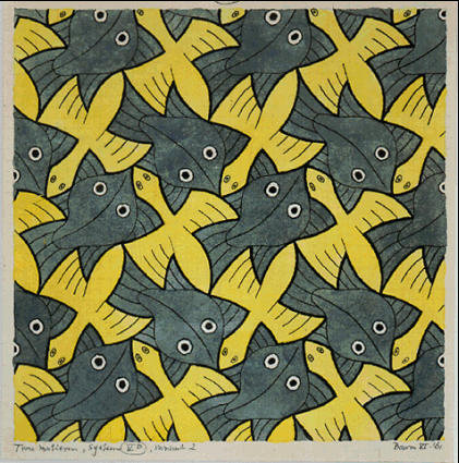
Escher
I decided to have a look at some of the work by Escher and see how he uses images forming a pattern using negative space. Most of the pieces that he has done for symmetry drawings are of natural forms either animals or have some relation to flowers shapes and patterns. They seem to fit together well and blend naturally.


Friday, 5 November 2010
Negative space
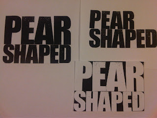
I decided to use the words "Pear shaped" to create my word with negative space I cut the letters from a font sheet and laid them down evenly spaced. using the enlargement formula for the photocopier I set the enlargement size to 157% which would make the word "Pear" the same length as "shaped".
I then cut them back out and lined them up so they were centred. Lastly using the negative control on the photocopier reversed the colour so I had the negative space visible.

I then cut them back out and lined them up so they were centred. Lastly using the negative control on the photocopier reversed the colour so I had the negative space visible.

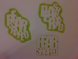
Using pens I copied over the negative space and tried rearranging and changing the position of the letters


Tuesday, 2 November 2010
Negative space
While looking for some images that make good use of negative space I came across the work of Noma Bar that I found very interesting, I think some of the pieces are controversial and use a play on stereotypes for example the piece called 'Hoodies' Noma Bar's work


Negative space
My new project is based on negative space in lettering and image. The first task I had was to cut letters out of a sheet that had been mixed up, to then arrange them into words but all that was really visible was the negative space. I managed to complete this task which took a little while but I managed to do it without finding any problems.


The next task is to make my own group of words to be at lease two or three lines long by cutting lettering out of a font sheet and arranging them, then photocopying and enlarging some sections to make a title like a newspaper headline. I decided I'd use the same wording as I did in my very first attempt at this as I knew it worked when I enlarged it.
As I didn't have a photocopier that could scale I decided to quickly try it out aligning it on the pc to see who it would look


I tried another quick one using numbers with letters
Sunday, 24 October 2010
A Visual Journey
For a visual journey, I decided to use things that I remembered from the trip, such as the SS Great Britain.

Using the pen tool in photo shop I drew and created a vector of the ship, I was only planning on using the area that is inside the box so I didn't finish of the rest of the drawing just to save time.

After drawing it and trying to fit it into the postcard design I decided I liked it better as a block colour so I gave it a black colour fill.

I wanted to create some kind of map to show the route I took, to do this I looked on line and found the website for the Bristol Ferry and a map of the routes they do.

I recreated the map by drawing roughly the area with the pen tool creating a vector.

The use of vector was working quite well so I decided to do the whole design in block colour drawings

Subscribe to:
Posts (Atom)