Sunday 24 October 2010

A Visual Journey

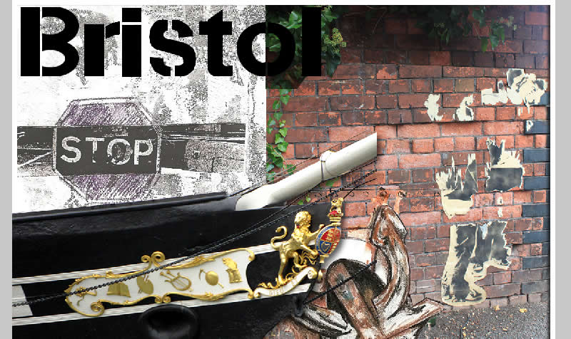
For a visual journey, I decided to use things that I remembered from the trip, such as the SS Great Britain.
Using the pen tool in photo shop I drew and created a vector of the ship, I was only planning on using the area that is inside the box so I didn't finish of the rest of the drawing just to save time.
After drawing it and trying to fit it into the postcard design I decided I liked it better as a block colour so I gave it a black colour fill.
I wanted to create some kind of map to show the route I took, to do this I looked on line and found the website for the Bristol Ferry and a map of the routes they do.  
I recreated the map by drawing roughly the area with the pen tool creating a vector.
The use of vector was working quite well so I decided to do the whole design in block colour drawings

Saturday 23 October 2010

Accidental Alphabet


Internal Environment design #2

I put this design together by printing an image of the ticket and album cover layered up on brown paper and using pieces of information ripped off of the ticket.
Included in the editing of the image I used photos, text dialogue that I picked up from the time spent in the venue and a quick drawing overlay within the image.
I'm happy with the result I got from this design, I think it looks good printed and on the computer.


Sense of Place Final Designs


Sense of Place Design #2

I used scanned images from my book & edited them mainly using the magic want tool to start with.
To create a quick title I drew the word Bristol and scanned it in to cut out, from the fist cut of the magic wand tool there are still some edges left but as I was going to give it a colour full and apply an effect it wouldn't show.
I liked the image of an old map I took from around the water front and the stencil of the sign I created in my book came out quite well so I decided to use both and overlay the map with the 'lighten' tool in Fireworks. 
Again using the magic wand in photoshop I roughly cut the ship, as the background is light it didn't need to be cleanly cut.

Sense of Place Post Card update

Using all the different image elements that I used the first time I added in a photo cut of the ship & changed the drawing of the anchor back to the original unedited version.
I decided to better fill the space I wanted to move the photo of the image on the wall up, but also wanted to keep the plant that was at the top, to do this I had to copy the top and blend it to overlay the lower part of the image.
 As there is a lot more shadowing at the top of the image to make the colours fit with the lighter, lower section of the photo I used the brightness/contrast to change the tone.
 I also decided that keeping the plant all the way down the image might be quite effective, just to break up the white section a little more. I cut out sections of it with the lasso tool till I was happy.
 To finish it I cut the edge around the photo to fit the edging of the 'paint' back in.
As a final design comparing it to the original edited image I had, I think it works a lot better as it has a feature associated with Bristol so is more easily identifiable to the area and particularly the water front, being a ship.


Friday 22 October 2010

Final Edited Design

This is the final design that I have created so far, I might want to work back into it at a later stage or test out some new ideas. Looking at the design I'm happy with it overall, if I do change anything I might see if there is a better composition as the space on the left looks a bit empty but I don't really want to add any more to it, so re-arranging it could be an option.
Thinking of a possible ideas for the space I could add some of the dialogue I got from people who were in the venue at the time.

Internal Environment: Jazz Cafe

Editing some ideas for a postcard representing time that I spent in the Jazz Cafe, London.
Mapping out the outline using 'pen tool' [Photoshop]
Again using the pen tool to fill in sections with colour, I used folders for sections to make it easy to edit if needed.
The final design & adding a little tint, gradient for some extra detail
Using effects to edit some of the font from the image [Macromedia Fireworks]
adding a photo I took of the outside of the venue into the image I used the 'Soft Burn' tool in Fireworks to get the effect for the colours to blend in, then cut out some of the unwanted part from the photo.


Tuesday 19 October 2010

Research

While looking through some design books 'Novum' & 'Computer Arts' I found some quite interesting design pieces that gave me some inspiration to come up with more ideas for postcard designs.
This page in Novum had some interesting designs that I like the use of text & illustration in the designs. 


Bettina Schulz, Novum, issue 01/10, packaging, Showroom: Red Dot Awards
Bettina Schulz, Novum, issue 01/10, packaging, Showroom: for better days


I looked online at the Website that was in the artical to see some more of the work I like this piece and think it relates a little to some of the work I was trying to achieve using a mix of media & layering it.

Artist: José Ignacio Fernández


Monday 18 October 2010

lesson time

Today I had a tutorial and discussed the ideas for the "sense of place" post card. We decided that it was going along the right route but looking at it without the title you couldn't really find the connection with Bristol, so I thought it might be good to add in an image to represent the water front such as the SS Great Britain. The next step I'm going to take to edit the image is to re arrange the images, maybe remove the filter from one of them leaving the original and using lines that appear in the image follow them across and fit the images together more effectively.

Wednesday 13 October 2010

Sense of Place Post Card

I started to look into scanning in and editing some of the pieces I had made in my book & arranging them into possible images for a post card.
Using effects & filters on a scan of the pencil drawing.
I made an attempt to draw out the title text from one of the information booklets I picked up from the waterfront that I had traced over top the image. 
After creating the lettering I needed to remove the text from the scanned image behind it, so I did this using the "Rubber Stamp tool" taking similar sections from the background to blend it it.

Monday 11 October 2010

lesson work

Today I continued to edit images by hand trying out a range of techniques. 
Pencil drawing of the anchor on the side of a boat and colour over top of a black & white photocopy

Using white acrylic painted in a thick layer on top of a printed photo, then turning it over and rolling it flat for a few minutes, carefully pealing back the paper and some of the image should be left on the page. The effect worked quite well in these two images I created.


Sunday 10 October 2010

editing

I put together some quick ideas and tried some techniques in my book using photos, prints from the ticket & invite.
Invite

Saturday 9 October 2010

Previous posts

October 5th 2010
Internal Environment
I made some really quick notes & screen captures on my blackberry while travelling & while in the Jazz Cafe to remind myself of things to remember after.


Previous posts

October 4th 2010
Internal Environment Planning
I have to spend two hours inside a venue of my choice getting a feel of the atmosphere to be able to represent it in a postcard.
I'm going to try London, Jazz Cafe 
I won tickets to a private concert for Tinie Tempah there on the 5/10/10 from about 7 to 10.30pm so I should have plenty of time to get a feel of the place the people who go there & the atmosphere. 


Previous posts

October 4th 2010
Experimental Ideas
+Using the photocopier, Photos, a craft knife & glue.
+cutting, copying & pasting images & sections to form another image approach.