Tuesday, 14 December 2010
Friday, 10 December 2010
Magazine Layout design
Again I tried out another layout looking at this spread from RWD Mag, I decided to base the main layout on this design.


To give myself guide lines I created a grid shape for the rough layout from different coloured sections. Then using the red guidelines I placed and sized an image to fit within the area.

Using the shape tool I drew out a coloured box for the right hand page and then as I was going to make the magazine spread based on Capital FM's Jingle Bell Ball concert I used the colour from their logo to fill it.

Again switching on the viability of the guidelines I added another image.


I wanted some images that broke out of the set layout a little so got an image and used the 'Elliptical Marquee tool' to cut a piece out into a circle, overlaying it on the colour filled column and the blank space next to it where the text would be. Using Grey lines to mark out where text would be printed I inserted text lines then cut a space around the image to show how it would be set.

Using the Polygonal lasso tool I marker around the edges of the image and cut it out, Then again cut the shape in to the text lines to show how it would sit.


I added in some more images and text space and decided to have the text in blue [taken from the logo] on top of the coloured column.

Where I was going to have a heading on the top of the coloured column I wasn't finding any fonts that I was happy with so decided I'd try something in Illustrator using things that I had learnt from the illustrator workshops I was able to look back at the notes I took and create the title I was looking for, text cut out of a colour block giving a bit of negative space.


Wednesday, 8 December 2010
Time lines
Timelines show a selection of information in a scale that enables you to see the whole thing.
Having a start and end usually displaying a period of time.
Orders information.
Planning for creating a timeline
-collect the information, time scale, dates, information, images etc.
-sketch out an idea for layout / print out the images / text and arrange them to gain an idea of how it would look.
Illustrator Tools that are helpful for creating the timeline
view > show Grid
illustrator > preferences > guides and grids -change grid size
file > place images [import images]
I put together a quick idea for a timeline this just shows how it could possibly be set out in a short amount of time.
with Gridlines
 Without Gridlines

Having a start and end usually displaying a period of time.
Orders information.
Planning for creating a timeline
-collect the information, time scale, dates, information, images etc.
-sketch out an idea for layout / print out the images / text and arrange them to gain an idea of how it would look.
Illustrator Tools that are helpful for creating the timeline
view > show Grid
illustrator > preferences > guides and grids -change grid size
file > place images [import images]
I put together a quick idea for a timeline this just shows how it could possibly be set out in a short amount of time.
with Gridlines


Tuesday, 7 December 2010
Magazine Layouts
Existing Layouts
I did a web search for magazine spreads and picked out a few that I found interesting from looking at there layouts, colours and content.
I quite like the way this page is set out with the black and white divided, I think it works well as the car is silver so has a lot of tones from white to black, I think the only thing I'm not sure about it the choice of the main title font, I don't think it's a slick font that I would expect from a car ad.


Another spread from RWD that I looked at was this, again the image comes over into the other page, I like this style and the way the text is laid out with the graphic feature within it.

creating my layouts Using photo shop I opened an A3 file and as each page of the magazine would be A4 I created two coloured sides that were A4 sized so I knew what area I was working in.
I then split one side into three with rough columns as I planned to use a large image spread on the left and text columns on the right so I was using the colour strips as guides.


I did a web search for magazine spreads and picked out a few that I found interesting from looking at there layouts, colours and content.
I quite like the way this page is set out with the black and white divided, I think it works well as the car is silver so has a lot of tones from white to black, I think the only thing I'm not sure about it the choice of the main title font, I don't think it's a slick font that I would expect from a car ad.

This spread from V magazine consists of one large photo spread across the two pages, I think it works very well as the main focal point of the image is on the side of the page and the way it leaks off of the edges works very well. The simplicity of the type looks good too having the main body in one font type and a small paragraph leading into the story in a slightly larger, different font catching the eye to make you read into it.

This spread in Miami magazine for a contents page looks good with a lot of white space. I think it has the right amount of image not to many but you get a feel of what's in the magazine, Headers are clear and you can find the information really fast, The positioning of the image and text is also nice and makes good use of space.

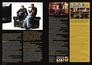
RWD Magazine spread, This is very simple but works as a way of including a lot of information but breaking it down with a large image that falls across to the right page. You immediately see the photo then your eye is attracted to the type on the image which is larger than the main body text again to try and draw you in to reading the article.


creating my layouts Using photo shop I opened an A3 file and as each page of the magazine would be A4 I created two coloured sides that were A4 sized so I knew what area I was working in.
I then split one side into three with rough columns as I planned to use a large image spread on the left and text columns on the right so I was using the colour strips as guides.

The image I used was quite large but wasn't quite the right height to fill the whole A4, I managed to stretch it a little which wasn't enough to distort it or loose much quality.
Using some logo text I found I decided I wanted to have it cut into the image and have that part just over laying the right side of the page, as the text was an image file and wasn't that big I had to stretch it a lot and cut it apart to use it as I wanted to. Using the coloured columns as a guide to the page divide I lined up the cut text vertically along the left side of the right page.
Then zooming in to 200% and selecting the image layer I used the polygonal lasso tool to cut out the space in the lettering. Once it was all cut I deleted I set the text layers to hide so I could see how it looked.

I decided I wanted a cut out image on the right to accompany the text, So using the polygonal lasso tool I marked around the edges and cut it out, when I had cut it out I tried a colour overlay and found I liked it better as a solid colour image.

Using Grey lines to represent text I drew out a space where the text columns would be set. Fitting around the silhouette image. Then adding a header above, I choose to have the title and image text in grey as I think it matches the image well and a page number at the top right corner aligned with the far column. Also adding two images aligned with a text column with the same dimensions to keep the page clean.
Lastly I added a caption on the main image again using the grey tones to relate to the page style.


Sunday, 5 December 2010
Finding The Grid
Looking at magazines and the way that they are set out I had to get some copies of magazines and draw out the grid / where I thought it to be, This is a layout I did from one magazine looking at both pages. I measured font sizes and also made note of leading depth.

Wednesday, 1 December 2010
Vector Drawing
Illustrator Vector Drawing and pen tool...
select pen tool (p) and click to start path
click and drag to create bezier curves.
To add points to the pathway click along the line (+)
To remove points, click them (-)
To cut path select scissors and click on path
To convert the path (shift C)
To move / adjust existing points select the second arrow tool and click on the anchor points
Cursors
website link to illustrator pen tool guide
Vector Drawing...
Import an image into illustrator
create a new layer and start drawing
layers can be turned on and off to make it easier to work
it may in most cases be easier to draw using just the outline switched on rather than the fill.
to create a completely straight line hold shift
alt + apple key to move on after bezier curve
To test out the pen tool and get an idea of how to use it to create curves I drew around the template of the lettering below following the instructions.

Taking a photo of myself with the web cam then opening it in illustrator I tried out the pen tool by testing out drawing layers of colour to create a vector.

Book cover layouts
Picking six titles from a list of book names, I looked at some fonts that I thought would suit the title then printed them out and traced them into a A5 space that could be used as a book cover.
I experimented with changing the size and slightly re arranging the letters.
Below shows some of the processes I went through to create the ideas for the title 'Street Life'.
Then I had to add images into the design and I used rough cut out photos first then had a go at drawing them out and I liked the way they came out.

Subscribe to:
Posts (Atom)