Novum 09/10 This was an add spread in the magazine.
Wednesday, 10 November 2010
Vectors
Looking through some journals I found a lot of examples of vectors these are a few that I picked out
Novum 09/10 This was an add spread in the magazine.
Illustrator
Today we had a quick introduction to Adobe Illustrator
Bitmap vs Vector
Bitmap is photographic and made up of pixels, this is what Photoshop uses where as Illustrator uses vector which has a path that describes the shape, this means that vectors can be enlarged without distortion where as bitmap images will become sharper when made smaller but as soon as they are enlarged slightly they become very pixelated.
The task we were given was to replicate the 'Ying Yang' sign and this was the result that I got..
Bitmap vs Vector
Bitmap is photographic and made up of pixels, this is what Photoshop uses where as Illustrator uses vector which has a path that describes the shape, this means that vectors can be enlarged without distortion where as bitmap images will become sharper when made smaller but as soon as they are enlarged slightly they become very pixelated.
The task we were given was to replicate the 'Ying Yang' sign and this was the result that I got..
I used six circles to create this image cut one in half and used different fills to get the right sections.
Some quick tools I noted down
-View > Turn on rulers
-View > Outline shows shapes
-holding space bar enables you to move around while using a tool
-create a line 'part' you can type along the path to that shape.
We were then left to experiment with some of the tools and as were looking at negative space I put together a really quick design using text, image and negative space.
Links
File Formats BMP GIF JPG PNG
I created Vectors before but using Photoshop, I'd like to be able to use illustrator to create some vector drawings mainly because of the flexibility with re-sizing the image. Where as with the vectors I have made so far the maximum size they can be is the size that I drew them.
Saturday, 6 November 2010
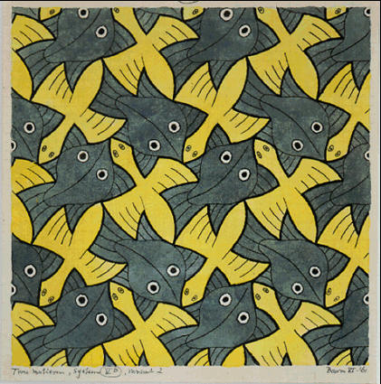
Escher
I decided to have a look at some of the work by Escher and see how he uses images forming a pattern using negative space. Most of the pieces that he has done for symmetry drawings are of natural forms either animals or have some relation to flowers shapes and patterns. They seem to fit together well and blend naturally.
Friday, 5 November 2010
Negative space
I decided to use the words "Pear shaped" to create my word with negative space I cut the letters from a font sheet and laid them down evenly spaced. using the enlargement formula for the photocopier I set the enlargement size to 157% which would make the word "Pear" the same length as "shaped".
I then cut them back out and lined them up so they were centred. Lastly using the negative control on the photocopier reversed the colour so I had the negative space visible.
Using pens I copied over the negative space and tried rearranging and changing the position of the letters
Tuesday, 2 November 2010
Negative space
While looking for some images that make good use of negative space I came across the work of Noma Bar that I found very interesting, I think some of the pieces are controversial and use a play on stereotypes for example the piece called 'Hoodies' Noma Bar's work
Negative space
My new project is based on negative space in lettering and image. The first task I had was to cut letters out of a sheet that had been mixed up, to then arrange them into words but all that was really visible was the negative space. I managed to complete this task which took a little while but I managed to do it without finding any problems.
The next task is to make my own group of words to be at lease two or three lines long by cutting lettering out of a font sheet and arranging them, then photocopying and enlarging some sections to make a title like a newspaper headline. I decided I'd use the same wording as I did in my very first attempt at this as I knew it worked when I enlarged it.
As I didn't have a photocopier that could scale I decided to quickly try it out aligning it on the pc to see who it would look
I tried another quick one using numbers with letters
Sunday, 24 October 2010
A Visual Journey
For a visual journey, I decided to use things that I remembered from the trip, such as the SS Great Britain.
Using the pen tool in photo shop I drew and created a vector of the ship, I was only planning on using the area that is inside the box so I didn't finish of the rest of the drawing just to save time.
After drawing it and trying to fit it into the postcard design I decided I liked it better as a block colour so I gave it a black colour fill.
I wanted to create some kind of map to show the route I took, to do this I looked on line and found the website for the Bristol Ferry and a map of the routes they do.
I recreated the map by drawing roughly the area with the pen tool creating a vector.
The use of vector was working quite well so I decided to do the whole design in block colour drawings
Subscribe to:
Posts (Atom)